Saturday, December 28, 2013
Sunday, November 3, 2013
UNION WAY good design in Portland
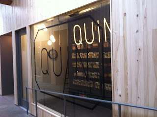
UNION WAY, joining the west end of downtown Portland with the Pearl District just north, is a rough (or rustic) gallery of shops, sort of an indoor urban mall. It is just good design, a place where you want to wander about, with rough board siding, exposed beams and skylights and with a variety of great shops like Steven Alan, Danner, a bakery, leathershop, Quinn the candy store, and more. Find Ace Hotel and Stumptown coffee across the street on the south and Powell's across from the north entrance.
Pics:
 Steven Alan
Pics:
 Steven Alan
Tuesday, July 24, 2012
EVIDENCE-BASED DESIGN and ELLSWORTH KELLY
Last week I saw the Ellsworth Kelly exhibit at the Portland Art Museum. I love his work, but I had to leave early. Why?
Well, although Kelly says he is not focusing on graphics in his work, the high contrast and graphic nature of his work brought on the tell-tell bright white light that tells me a migraine is coming my way.
See what I mean:


Artists don't have to worry about function so much, but interior designers do.
In design school I learned always to have at least one reason for any choice (and "I like it" is not one), and to always think about function or effect. For example, I learned to consider color choices in terms of their effects. Stuff like: yellow is intellectually stimulating (so it goes on the walls of schools - remember that pale stuff we all endured?); red is a color we respond quickly to, but then it tires us out a little (so it goes in brothels!); or photos of nature are soothing and even curative (great for hospitals and clinics).
This was just part of design. I didn't learn the words "evidence-based design" until recently.
And I think it is just another way of describing good design. Steve Jobs had it right when he said:
Design is a funny word. Some people think design means how it looks. But of course, if you dig deeper, it's really how it works.
Read more at http://www.brainyquote.com/quotes/authors/s/steve_jobs.html#WrFkyusJmYW0JdIW.99
Well, although Kelly says he is not focusing on graphics in his work, the high contrast and graphic nature of his work brought on the tell-tell bright white light that tells me a migraine is coming my way.
See what I mean:
Artists don't have to worry about function so much, but interior designers do.
In design school I learned always to have at least one reason for any choice (and "I like it" is not one), and to always think about function or effect. For example, I learned to consider color choices in terms of their effects. Stuff like: yellow is intellectually stimulating (so it goes on the walls of schools - remember that pale stuff we all endured?); red is a color we respond quickly to, but then it tires us out a little (so it goes in brothels!); or photos of nature are soothing and even curative (great for hospitals and clinics).
This was just part of design. I didn't learn the words "evidence-based design" until recently.
And I think it is just another way of describing good design. Steve Jobs had it right when he said:
Design is a funny word. Some people think design means how it looks. But of course, if you dig deeper, it's really how it works.
Read more at http://www.brainyquote.com/quotes/authors/s/steve_jobs.html#WrFkyusJmYW0JdIW.99
Friday, June 22, 2012
AXEL VERVOORDT, OH, YEAH
I recently whined that "Elle Decor" left out the designers on its "Top Sixty" I admire most: Thad Hayes, Kara Mann and Axel Veervoordt.
Vervoordt, a Belgian antiques dealer and interior designer to Sting, among others, appreciates wabi sabi, the Japanese concept that sees beauty in the imperfect, the worn, the old. (I just saw a photo of a Japanese teacup whose cracks had been filled with gold.)Anyhow, I love Vervoordt's work. It reminds me of a Vermeer painting even when it includes contemporary art like a Basquiat painting.
Here are some pics of it:
Above is a Basquiat painting in the background! Street-inspired art with a Buddha, both beautiful ideas.
One of Vervoordt's first books above.
 |
| Note painting with all this rusticity. |
 |
| This kitchen and fireplace below are in a mountain chalet in uber chic Verbier, Switzerland. |
This degree of purity knocks me out.
Below: Jan Barrett designed this small tv room before she knew Vervoordt's work. It has the same combo of luxe, with its silk and italian wool and silver leaf art, paired against the old rustic picnic table from the 1950's, though not the country antique AX would have, of course.
Thursday, June 7, 2012
"ELLE DECOR" CALLED OUT 60 TOP TALENTS i.e. Interiors Designers. Really?!!
I was all ready to write something really snarky about "Elle Decor" for omitting my favorite designers and including designers who I think are......corny or boring or too bourgie. Then I looked at the list again and it is subtitled "the Designers Who Inspire Us Most." Well, as my father-in-law, Beach, used to say "de gustibus non disputatum." That's probably declined improperly but it means "there's no disputing taste." Or as Woody Allen would say: the heart wants what the heart wants.
So their list is particular to their view, but how could they leave out Thad Hayes or Kara Mann or Axel Vervoodt?
Thad Hayes' work:
 |
| This makes me swoon. |
 |
| The play between the Tiffany lamp and the painting only reinforces each. |
 |
| I am a sucker for the Richard Serra lithograph on the left, reinforced by the Isamu Noguchi paper lantern. |
Saturday, March 17, 2012
High and Low
I came across a blog the other day called "Ikea Hacker". The writer posts Ikea products that have been altered, often to great effect. Ok, I can be a snob, a fact that my best friend, Mary, says is one of the things she loves best about me, but even snobby me can appreciate a simple thing, not necessarily luxurious, but one that has style.
Even Architectural Digest last month had a cover of Brook Shield's chic NYC digs with a Pottery Barn sisal carpet next to her Empire chest and what looked like Louis XVI chairs.
When I couldn't find a simple and small daybed for my studio, I bought a child's bed from Ikea, had the legs silver-leafed and had a cover made. The cover is Calvin Klein fabric for Kravet, a wool with cut velvet - maybe it's making a silk purse out of a sow's ear, but it is soft and a nice alternative to a sofa.
Here it is:
Sunday, March 11, 2012
MORE LIGHTING, TOM DIXON, AND STUDIO TOOGOOD
Muriel Chandelier for Oly Studio - made of resin.
This would also be great hung over a coffee table.
Last week we showed you Tom Dixon's Lightweight chandelier:
Studio Toogood recently did a new studio in London for Tom Dixon. Faye Toogood, her real name, heads up the group. Check out their designs at http://www.studiotoogood.com/our-work/interior-design/townhouse-interior/london-town-house-gallery.
Images below are from Studio Toogood:
Subscribe to:
Comments (Atom)


